Real Client Example
See real work example:
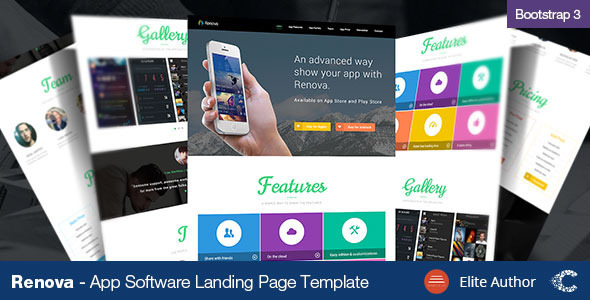
Renova is a Premium Landing Page. This Theme is clean and well organized.
Renova Landing Page takes good use of the Z Reading pattern to guide the eye around the design and ultimately convert your visitors into subscribers or buyers.
Landing Page: Some Basics about Renova Landing Page
A Landing page should be always plain and simple. In certain way you control so the attention of your readers.
1. The main headline
Your headline is the very first thing that people will see and read. It’s critical that it very clearly describes what a visitor will get from the page (its goal) and that the message match is strong enough to show the visitor that they are in the right place.
2. The supporting headline
It is important to extend the message by applying an additional persuasive message to support the primary one.
3. The Hero Shot (Photo or Video)
The hero shot is the visual representation of your offer and can help people to gain a better understanding of what it is or what it looks like.
4. Features
Here you have to provide a little more detail to the offer to answer any questions they may have. Try to focus on answering the question “What will this do for me?”, as this will help you to write copy that speaks directly to your customers questions.
5. Testimonials
Testimonials is a powerful persuasive concept. Simply put it’s the use of real people testimonials to illustrate that other people have bought/consumed/read/participated in, what you are offering. The concept being that you are more likely to convert if you see that others before you have, and were glad they did.
6. The conversion goal
Your conversion goal is a term that describes what the purpose of the page is to you. This is presented in the form of a Call-To-Action (CTA), which can either be a standalone button on a click-through page, or as part of a lead gen form.
At Renova Landing Page you have Call-To-Action (CTA) buttons at the top of the page so the user can buy or try the demo right away.
Tested on
- iPhone 3+4 portrait 320×480
- iPhone 3+4 landscape 480×320
- iPhone 5 portrait 320×568
- iPhone 5 landscape 568×320
- Android portrait 240×320
- Android landscape 320×240
- Android (Samsung Galaxy) portrait 380 by 685
- Android (Samsung Galaxy) landscape 685 by 380
- iPad portrait 768×1024
- iPad landscape 1024×768
- Kindle portrait 600×1024
- Kindle landscape 1024×600
Features
- 6 Options
- Retina Ready
- Bootstrap 3
- Unlimited Color Options
- Valid HTML
- Super Clean Code
- SEO Optimized
- Responsive Pricing Tables
- Over 390 icons
- Cross Browser compatible
- Google Web Fonts integrated
- Working Form
- jQuery powered
- All Templates PSD’s included
- Well documented
Zip includes
- 6 HTML Files
- 1 PSD File
- Documentation
NOTE: The online samples images belong to their respective owners and are only used for demo purposes.
Updates
v1.2 – 1 October 15
- Newsletter php fixed
v1.1 – 14 September 14
- Documentation improved
v1.0 – 30 July, 2014
- Initial release
Tags
Landing page, Landing Page Template, lead generating landing page, Call-to-Action, working form, One Page Responsive Landing Page, Multipurpose Landing Page Template – All in One, agency, corporate, portfolio, app theme, landing app, theme software, templates app, freelancer or general business, agency, business landing page, corporate, startup apps templates, template app android, template app mobile, design, html5, landing page, modern, multipurpose, startup landing, app theme, app template, portfolio, quality landing, studio landing
