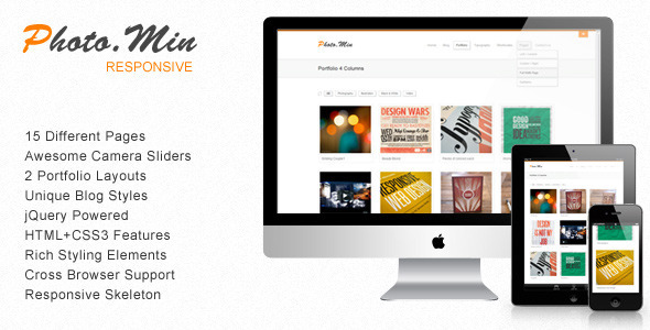
Photomin is the perfect responsive template designed in a clean and minimalistic style. This template is very flexible, easy for customizing and well documented, approaches for personal and professional use. Photomin has been coded in HTML & CSS3 and jQuery.
It’s developed on the Skeleton -- beautifull boilerplate for responsive development so it look beautiful at any size, be it a 17” laptop screen or an iPad, iPhone.
Visit the responsive preview site and resize your browser to see it in action or visit Photomin directly on your mobile device.
Visit Photomin on your Small Devices
Template Features
- Awesome Camera Slider
- Filterable Portfolio
- 2 Porfolio Layouts with Pretty Hover Effects
- 4 Columns
- 3 Columns
- Unique Blog Style
- Blog Post Formats (image, gallery, video, audio, link, aside, quote)
- jQuery Powered
- Cool CSS3 Features
- Responsive Layout
Rating
If you like my work, please rate it. If you’re about to rate it with less than 5 stars, please let me know the reason first and I will do my best to improve the theme.Thanks so much!
Get New Theme Releases and Updates by Email!
Want more themes like this? Sign up to the Color Theme newsletter and we’ll keep you up-to-date with updates, release dates and early demo access – nice! Sign up for the newsletter over here
Recent Projects
Pravda – Retina Responsive WordPress Blog ThemeNewsTrick – Responsive WordPress Magazine / BlogTrustMe – Responsive WordPress Magazine / BlogCrossRoad – Responsive WordPress Magazine / BlogCrumble – Responsive Wordpress Magazine / BlogAtlantic News – Responsive Wordpress Magazine / Blog
