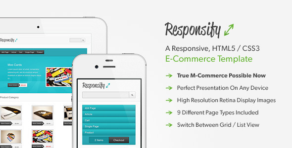
Responsify is a professional, customizable and responsive e-commerce theme written in HTML5 / CSS3 which adapts perfectly to the viewers screen resolution and provides a seamless and rich shopping experience on any device.
Due to its clean source code and structure, it can be integrated into literally any e-commerce platform you’ll choose. To get a better impression about how that could look like, I’d like to encourage you to have a look at the already available Shopify version of this template you can try and purchase here.
Please Note: If you’d like to preview the smartphone version, please make sure to remove the black ThemeForest frame on top first -- otherwise, those devices will just display the tablet version.
- Responsive
Every part of the template seamlessly adapts to your customers screen resolution and device orientation in order to provide a rich and satisfying shopping experience. Just manage your products and enjoy how easy it will be for your customers to browse and purchase your products from wherever they might be -- no matter if they use a desktop computer, a tablet or even a smartphone! - 9 Page Types
Nine different page types including the unique homepage layout, a category overview, product page, cart, search results as well as regular content pages have been prepared -- all of these are responsive and look great on a wide variety of devices! - M-Commerce Ready
Mobile E-Commerce or M-Commerce rapidly becomes more and more important these days. Rest assured -- with Responsify you’ll be up and running with that in no time. In addition to that, any element your customers can interact with provides appropriate visual feedback which enriches the experience even further, especially on touch enabled devices. - Handcrafted Design
The clean and unobtrusive visual appearance has been designed focusing on simplicity and attention to details. Every element has been carefully crafted and positioned so it creates a professional and reliable impression. - Quality Code
Responsify has been written in clean and valid HTML5 and CSS3 keeping todays best practices in mind. While looking fantastic in current browsers, it degrades gracefully if significantly older versions will be used and looks great in browsers which meet todays standards accordingly. - Customizable
The entire color scheme can be easily adjusted to your needs – detailed instructions how to do that included within an extensive documentation. - Retina Display Enhanced
In order to ensure your business really shines on any device, high resolution retina images have been implemented accordingly so everything looks clear and sharp on devices like the iPhone 4 / 4s too. - Different Views
Sometimes it’s more convenient to get an overview from another point of view. Because of that, Responsify supports a grid and a list view to choose from dynamically. - Product Slider
Don’t just show your products in a regular list or grid view -- now you can present them in an even more attractive way increasing the sales efficiency of your business. - Documentation & Support
A detailed documentation covering all aspects such as how the slider works, how you can switch between different styles, what you’ll need to do in order to change the colors or how you can implement the newsletter subscription form successfully has been included for your convenience. If you should experience any problems or if you got questions in general, you can always send me an email and I’ll be glad to assist usually in between 24 and 48 hours.
Updates
- 01/11/2012 jQuery and Performance Update
- 12/14/2011 PSD File & Drop Down Menu Support Added (Documentation Includes Details How to Enable It).
